

Rethinking Remote Healthcare
Redesigning a telemedicine platform around asynchronous care — cutting cognitive friction, restructuring clinical intake, and lifting form completion.
Overview
The physician travelled constantly and his patients were spread across several time zones, which made real-time consultations effectively impossible to schedule. At the same time, seven out of every ten patients who started the intake form abandoned it before finishing.
As Senior Product Designer, I led the redesign end to end — from rethinking the consultation model to re-architecting the clinical intake flow and building the design system.
- Problem
- 70% left the form in its first step
- Approach
- Async consultations, conditional intake
- Outcome
- 40% less time to complete the form
The Challenge
Rather than starting with the interface, I started with the data and the physician's actual working day:
- Drop-off happened at the start, not the end. Historical data showed abandonment wasn't a last-mile problem — 70% of users left within the first few questions. The issue wasn't motivation, it was volume.
- Real-time scheduling didn't match reality. No fixed slot survived contact with the physician's travel calendar, so every booking needed manual coordination.
- The form was a wall, not a conversation. Every clinical question sat on one long page, with no indication of why any of it mattered.
Design Decisions
From data collection to intelligent triage
The obvious fix was to cut fields — but every field removed meant a weaker diagnosis. Instead, I rebuilt the structure around conditional logic:
- Micro-segmentation: Three to five related questions per step, never a single long page.
- Clinical context on demand: Sensitive questions carried a short note explaining what the answer contributes to the diagnosis. Resistance dropped noticeably.
- Dynamic pruning: Irrelevant questions disappeared based on earlier answers, cutting time-to-completion by 40% without losing a single clinical data point.
Impact
- Higher completion: Restructuring the information architecture translated directly into more completed intakes and more booked consultations.
- Physician autonomy: The time-zone problem disappeared, and control over response timing went back to the physician.
- Faster delivery: Aligning the design system with the codebase shortened the loop between design and front-end.
The Part That Was Not Design
This project was close to being shelved. What I did went well past screen design: managing stakeholder expectations, using behavioural data to steer decisions, and rescoping the product within the regulatory constraints of healthcare.
Revisiting It in 2026
If I designed this today, I would move from list-based management to something more intuitive. Back then I optimised for function; now my priority would be lowering the physician's mental load while managing appointments.
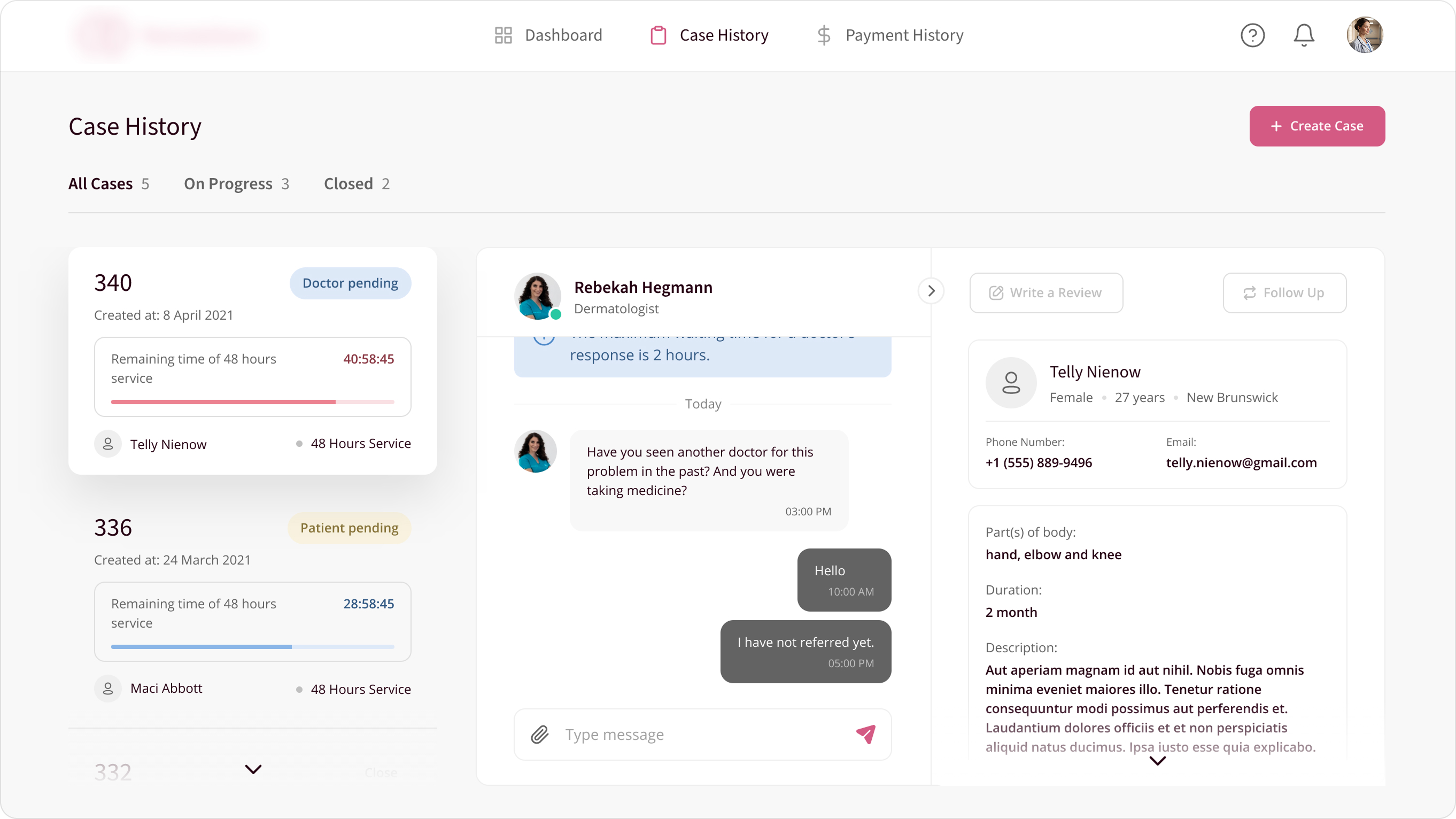
- From static lists to a dynamic space: The classic three-column layout gives way to intelligent layering that returns the physician's focus from file management to patient care.
- Visual time management: Anxiety-inducing countdowns are replaced by prioritised alerts that ask for attention only when it's warranted.
- A focused palette: Deep, neutral tones to reduce eye strain over long sessions, with accent colour reserved strictly for urgent actions.
- Records in reach, not in the margin: The patient record moves from a fixed column into an interactive space beside the conversation, accessible without breaking the thread.